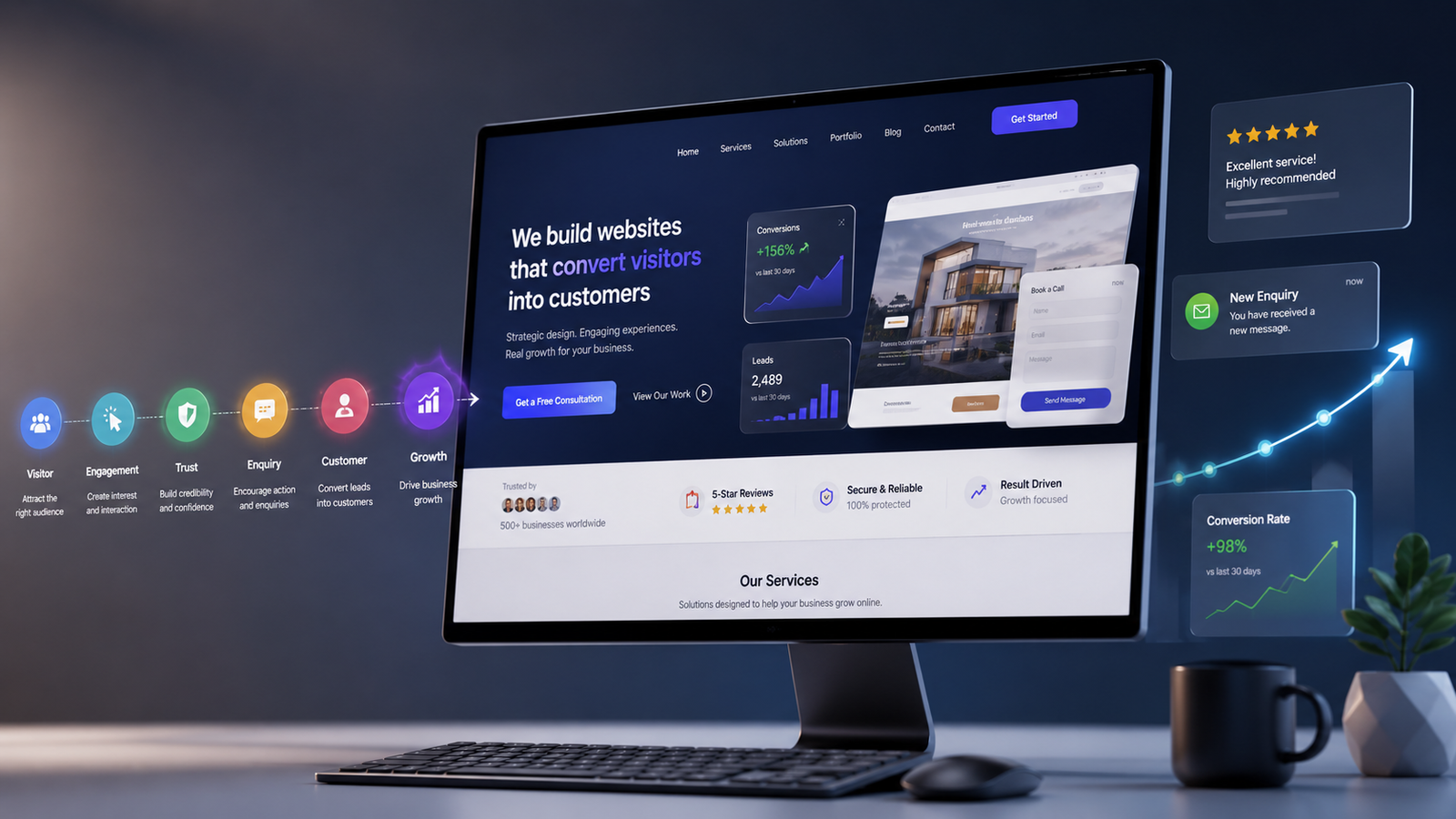
A website can look beautiful and still fail to generate customers.
The difference between an attractive website and a high-converting website is strategy. A high-converting website is designed around what visitors need, what the business wants to achieve, and how easily the two can connect.
In 2026, having a website is no longer enough. Customers expect fast loading times, mobile-friendly experiences, clear information, trustworthy businesses, simple navigation, and an obvious next step.
At the same time, the way people discover businesses is changing. Search engines, social platforms, and AI-powered search tools are becoming important parts of the customer journey.
So how do you build a website that actually converts visitors into customers?
Here are 15 proven strategies to help you create a high-converting website in 2026.
What Is a High-Converting Website?
A high-converting website is a website designed to encourage visitors to take meaningful actions that support a business goal.
A conversion could be:
• Making a purchase • Requesting a quote • Booking an appointment • Filling out a contact form • Calling the business • Starting a free trial • Signing up for a service • Downloading a resource • Sending an enquiry • Subscribing to a newsletter
Conversion does not always mean an immediate sale.
For a service-based business, a website visitor submitting an enquiry can be just as valuable as an e-commerce customer completing a purchase.
The key is to define what conversion means for your business and design the website around that goal.
1. Define One Primary Goal
Before designing your website, determine what you want visitors to do.
A website can have multiple actions, but there should usually be one primary goal.
For example:
A web design agency may want visitors to request a consultation.
A restaurant may want visitors to make a reservation.
An e-commerce store may want visitors to purchase products.
A consultant may want visitors to book a discovery call.
A software company may want visitors to start a free trial.
Once you define the primary goal, your page structure, messaging, buttons, forms, and content can all work together toward the same outcome.
Without a clear goal, a website can easily become a collection of attractive sections without a clear customer journey.
2. Make Your Value Proposition Clear Immediately
Visitors should understand what your business does and why it matters without having to search through your website.
Your main headline should communicate your value clearly.
Instead of:
"Welcome to Our Website"
try something more specific:
"High-Performance Websites Designed to Help Your Business Generate More Customers"
A strong value proposition should answer three basic questions:
What do you offer?
Who is it for?
Why should someone choose you?
The clearer your message is, the easier it becomes for the right visitors to understand that they are in the right place.
3. Design Your Homepage Around the Customer Journey
Your homepage should guide visitors from their first impression toward a logical next step.
A strong homepage structure can look like this:
Clear headline and value proposition
Primary call to action
Brief explanation of your solution
Key benefits
Services or products
Social proof and testimonials
Portfolio, case studies, or results
Frequently asked questions
Final call to action
This structure works because it gradually answers the questions a visitor is likely to have.
What do you do?
Can you solve my problem?
Why should I trust you?
What makes you different?
What should I do next?
Your homepage should not simply display information. It should guide the visitor.
4. Use Clear and Action-Oriented CTAs
A call to action tells visitors what to do next.
Examples include:
"Get a Free Quote"
"Book a Consultation"
"Start Your Project"
"Request a Callback"
"Get Started"
"Shop Now"
"Speak With an Expert"
Avoid vague buttons such as:
"Click Here"
"Submit"
"Learn More"
when a more specific action can be communicated.
Your CTA should make the benefit or next step obvious.
Also, don't hide your main CTA at the bottom of the page.
Place relevant calls to action throughout the customer journey so visitors can act when they are ready.
5. Build Trust Before Asking for the Sale
Visitors may be interested in your product or service, but interest alone does not create a conversion.
Trust matters.
Your website should provide evidence that your business is credible and capable.
Useful trust signals include:
• Customer reviews • Testimonials • Case studies • Portfolio examples • Client logos • Certifications • Awards • Guarantees • Industry experience • Clear contact information • Secure payment options where applicable
Don't simply say that your business is trustworthy.
Show visitors evidence.
For example, instead of saying:
"We provide excellent service."
show a customer testimonial, project result, or case study that demonstrates it.
6. Make Your Website Mobile-First
A high-converting website needs to work exceptionally well on mobile devices.
Visitors should not have to pinch, zoom, rotate their phones, or struggle to click small buttons.
Check that:
• Text is easy to read • Buttons are easy to tap • Navigation works smoothly • Forms are simple to complete • Images scale correctly • Important content is easy to find • Pop-ups do not block the entire screen • Pages load quickly
Mobile-first design is not simply about making a desktop website smaller.
It means designing the experience around how people actually use smaller screens.
7. Improve Website Speed and Performance
Nobody enjoys waiting for a website to load.
Slow websites create friction and can cause visitors to leave before they see your offer.
Improve performance by:
• Compressing images • Using modern image formats • Optimising fonts • Reducing unnecessary scripts • Removing unused code • Limiting heavy animations • Using browser caching • Choosing reliable hosting • Optimising third-party integrations
Performance should be considered from the beginning of the design and development process rather than treated as an afterthought.
A faster website provides a better experience and creates fewer barriers between visitors and conversions.
8. Keep Navigation Simple
Your website navigation should help visitors find important information quickly.
For many businesses, a simple navigation structure might include:
Home
About
Services
Portfolio or Case Studies
Blog
Contact
Depending on the business, additional pages may be necessary.
However, adding more menu items does not automatically make a website better.
Too many choices can create decision fatigue.
Keep your navigation organised, predictable, and focused on the pages visitors actually need.
9. Reduce Friction in Your Forms
Contact forms are often one of the most important conversion points on a business website.
But long and complicated forms can discourage visitors.
Only ask for information you genuinely need.
For a simple enquiry, you may only need:
Name
Phone number
How to Build a High-Converting Website in 2026: 15 Proven Strategies
Message
If you need additional information to qualify a lead, explain why the information is useful.
You can also improve form conversions by:
• Using clear labels • Providing helpful validation messages • Making fields easy to complete on mobile • Showing what happens after submission • Using a clear submit button • Avoiding unnecessary required fields
The easier it is to complete the form, the fewer opportunities there are for visitors to abandon it.
10. Write Website Copy Around Customer Problems
One of the biggest mistakes businesses make is writing website content entirely around themselves.
Visitors are primarily interested in their own problems, needs, goals, and outcomes.
Instead of repeatedly saying:
"We provide professional digital marketing services."
focus on the result:
"Build a stronger online presence, attract more qualified visitors, and turn website traffic into customers."
Good conversion-focused copy should explain:
The problem
The solution
The benefits
The proof
The next step
Your website should make it easy for visitors to understand how your product or service can improve their situation.
11. Create Dedicated Pages for Your Services
If your business offers multiple services, don't force every service into one crowded page.
Create dedicated pages for important services.
For example, a digital agency might have separate pages for:
Web Design
Web Development
SEO
Digital Marketing
Social Media Marketing
E-commerce Development
Each page can explain the specific service, benefits, process, results, FAQs, and next steps.
Dedicated service pages can also help search engines understand what your business offers and allow you to target more specific search queries.
12. Optimise Your Website for Search and AI Discovery
In 2026, your website needs to be discoverable wherever potential customers are searching.
Traditional SEO remains important, but the search landscape is becoming broader.
People may discover businesses through:
AI-powered search
ChatGPT
Social media
YouTube
Online communities
Maps and local search
Your website should provide clear, useful, trustworthy information that can be understood by both people and search systems.
Focus on:
• Helpful and original content • Clear page structure • Relevant search intent • Descriptive headings • Strong internal linking • Well-written service pages • Authoritative information • Fast performance • Mobile usability • Clear business information
Don't create content simply to target keywords.
Create content that genuinely answers the questions your potential customers are asking.
13. Use Social Proof and Real Results
People naturally want to know whether other customers have had a good experience with your business.
Social proof can significantly strengthen your website.
Useful examples include:
Customer testimonials
Google reviews
Before-and-after examples
Case studies
Project results
Customer numbers
Ratings
Client logos
Industry awards
When possible, make your proof specific.
Instead of:
"Great service!"
a detailed testimonial explaining what problem the customer had and how your business helped them is much more useful.
Case studies are especially powerful because they can demonstrate your process and results at the same time.
14. Track Conversions and Visitor Behaviour
You cannot effectively improve a website if you don't know what visitors are doing.
Set up analytics and conversion tracking to understand how your website performs.
Track important actions such as:
• Form submissions • Phone clicks • Email clicks • WhatsApp or messaging clicks • Purchases • Bookings • Downloads • CTA clicks • Sign-ups
Also monitor:
• Traffic sources • Popular landing pages • Engagement • Device types • Exit pages • Conversion rates
This data can reveal where visitors are getting stuck.
For example, if a page receives a large amount of traffic but very few people contact you, the problem may be your messaging, CTA, offer, trust signals, page structure, or user experience.
Data gives you a starting point for improving the website.
15. Keep Testing and Improving
Your website does not have to be perfect on day one.
The best websites are continuously improved.
You can test:
• Headlines • CTA wording • Button placement • Images • Forms • Page layouts • Offers • Testimonials • Pricing presentation • Navigation
This process is known as conversion rate optimisation, or CRO.
Instead of guessing what visitors prefer, use real data to make informed improvements.
Even small changes can make a meaningful difference when they remove friction or make the value of your offer clearer.
A High-Converting Website Checklist
Before launching or redesigning your website, ask yourself:
Is the main purpose of the website clear?
Can visitors understand what the business offers quickly?
Is the value proposition easy to understand?
Is there a clear primary CTA?
Does the website work properly on mobile devices?
Does it load quickly?
Is the navigation simple?
Are important services explained clearly?
Are there genuine reviews or testimonials?
Are there case studies or examples of previous work?
Is the contact process simple?
Are forms easy to complete?
Is the website optimised for search?
Is the content useful for your target audience?
Can you track important conversions?
Do you have a process for testing and improving the website?
If you answered yes to most of these questions, you're building on the right foundation.
Common Website Conversion Mistakes to Avoid
Even well-designed websites can lose potential customers because of small mistakes.
Avoid:
• Unclear headlines • Too many competing CTAs • Long and complicated forms • Slow-loading pages • Poor mobile design • Low-quality images • Weak or generic content • Missing testimonials • Difficult navigation • Hidden contact information • Too many unnecessary pop-ups • Autoplay audio • Confusing pricing • Stock imagery that doesn't represent the business • Pages with no clear next step
A high-converting website is often less about adding more elements and more about removing unnecessary friction.
Final Thoughts
Building a high-converting website in 2026 requires more than attractive visuals.
A successful website combines strategy, design, user experience, performance, content, SEO, trust, analytics, and continuous improvement.
Your website should make it easy for the right people to discover your business, understand your value, trust your brand, and take action.
Remember these five principles:
Make your value clear.
Build trust.
Remove friction.
Guide visitors toward the next step.
Measure and improve.
When these elements work together, your website becomes more than an online brochure. It becomes an important part of your sales and marketing system.
At My Digital Creations, we believe a website should be built with a purpose. It should not only look professional but also create a better experience for visitors and support real business goals.
If you're planning a new website or want to improve the performance of your existing one, My Digital Creations can help you build a digital experience designed around your business and your customers.
Want Help With This?
Let's talk about how this applies to your business.